
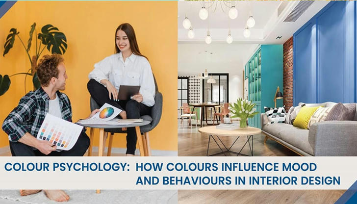
The Psychology of Color in Interior Design: Choosing the Right Hues for Your Mood and Space
Color is more than just an aesthetic choice in interior design—it can influence mood, behavior, and even productivity. Whether you’re redesigning your living room or picking a fresh coat of paint for your bedroom, understanding how different colors affect your emotions and the functionality of a space can lead to a more intentional and harmonious home.
In this article, we’ll explore how the psychology of color can shape your environment, help you make thoughtful design choices, and create spaces that reflect your personality and needs.
Understanding the Impact of Colors on Mood and Behavior
Colors have a profound effect on our emotions and can influence our reactions to a space. They can energize us, calm us, or make us feel at ease. The key to using color effectively lies in knowing which hues to choose depending on the type of atmosphere you want to create.
Warm Colors: Energizing and Inviting
Warm colors—such as red, orange, and yellow—are known for their ability to stimulate energy and warmth. These colors tend to evoke excitement, passion, and joy, making them ideal for spaces where you entertain guests or engage in high-energy activities. For example, red can bring a sense of vibrancy to a living room, while orange offers a cheerful and creative atmosphere, perfect for home offices or kitchens. Yellow, being the color of sunshine, is great for promoting positivity and focus.
However, it’s important to balance these tones. Too much of a warm color can create an overwhelming or even agitating effect, so incorporating neutrals or accent colors can help maintain harmony.
Cool Colors: Calm and Relaxing
Cool colors, like blue, green, and purple, are known for their calming effects. These shades create a sense of tranquility and relaxation, making them perfect for spaces where you want to unwind, such as bedrooms or bathrooms. Blue is often associated with serenity and stability, promoting a peaceful environment. Green, the color of nature, brings a sense of balance and restoration, making it a wonderful choice for spaces meant for relaxation. Soft purples can bring a luxurious, soothing vibe.
These cool tones are ideal for areas designed for rest or concentration, as they help lower stress levels and promote a calm, restful atmosphere.
Neutral Colors: Balancing and Flexible
Neutral colors such as white, gray, beige, and brown provide a perfect backdrop for any design. They offer balance and flexibility, making them ideal for creating a soothing and timeless environment. Neutral tones are versatile, allowing other colors or design elements to stand out without overwhelming the senses. These colors can help create a clean, sophisticated look, whether you’re designing a minimalist bedroom or a cozy living room.
What makes neutrals so attractive is their ability to blend with any style or color palette, providing a subtle and refined look that adapts to various design trends.
Choosing the Right Color for Each Room
Each room in your home serves a different purpose, and the colors you choose should reflect that purpose. Understanding how different colors work in different spaces can help you create a more functional and comfortable environment.
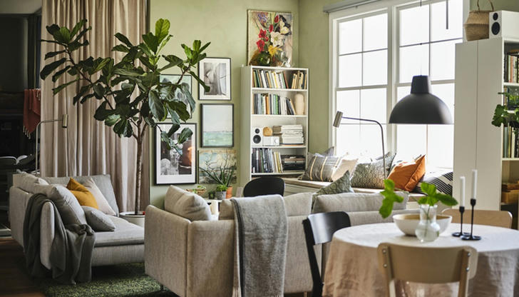
Living Room: Creating a Welcoming Atmosphere
Your living room is often the heart of your home, where you spend time with family, entertain guests, or relax after a long day. Here, warm and neutral tones work well to create a balanced, welcoming environment. A soft beige or light gray can make a room feel open and inviting, while a pop of color, like a rich coral or teal, can infuse personality and vibrancy.
If you want to make your living room feel cozy and intimate, consider darker hues like charcoal or navy blue. These tones can give a more grounded, sophisticated feel without being too overwhelming.
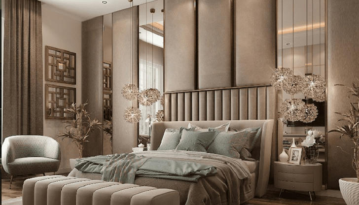
Bedroom: Promoting Restful Sleep
The bedroom is meant to be a place of rest and relaxation, and the colors you choose should support that purpose. Soft blues, pale greens, and lavenders are all great options for creating a tranquil and serene atmosphere. These colors help reduce stress and promote restful sleep, which is why they’re so often used in bedrooms.
If you prefer a bit of warmth, soft peach or a warm beige can also create a soothing environment. Avoid too many bold or bright colors, which can be overstimulating and may disrupt your ability to wind down.
Kitchen: Stimulating Appetite and Creativity
The kitchen is a space where you prepare meals, socialize, and often spend a significant amount of time. As such, it’s important to choose colors that stimulate the senses without overwhelming them. Warm colors like red, orange, and yellow are excellent choices for kitchens, as they can stimulate appetite and conversation. Red, in particular, is known to increase energy and boost metabolism, making it a great accent color for kitchen spaces.
However, be mindful of overusing these vibrant shades—using them as accents on walls, cabinets, or accessories can help achieve a balance without making the space feel too intense.
Home Office: Boosting Productivity and Focus
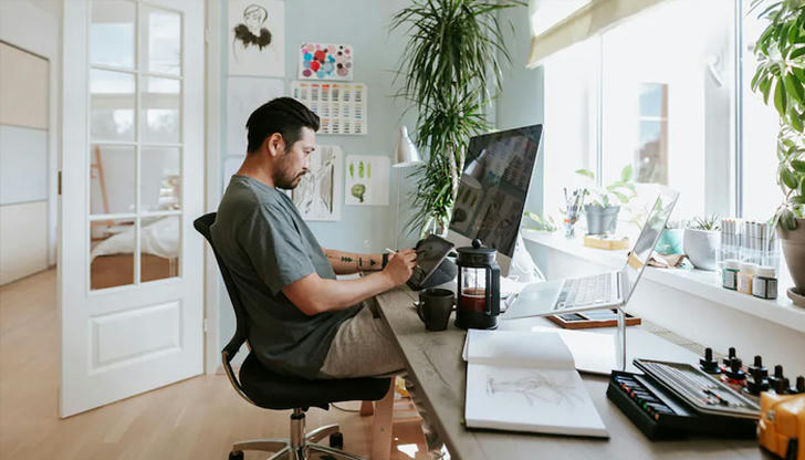
If you work from home, your office space should be designed to foster concentration and productivity. Cool colors like blue and green are perfect for promoting calm and focus. Blue encourages clear thinking and creativity, making it ideal for tasks that require problem-solving or concentration. Green, being a restful color associated with nature, helps reduce stress and promotes focus.
You can also incorporate neutrals or even soft yellows to create a bright, energizing environment. Avoid overly dark colors, which can make the space feel heavy or stifling.
How to Use Color to Maximize Space and Light
The size of a room and the amount of natural light it receives can affect how colors are perceived. Knowing how to use color strategically can help you make the most of your space.
Small Rooms: Making the Most of Limited Space
If you’re working with a small room, lighter colors can help create the illusion of space and openness. Soft whites, pale blues, and light grays can reflect light and make a room feel larger. These colors work particularly well in small bedrooms, bathrooms, or entryways.
Additionally, incorporating mirrors or reflective surfaces can further enhance the sense of openness and brightness in a small room.
Large Rooms: Creating Coziness and Intimacy
In large spaces, darker shades can help bring a sense of intimacy and warmth. Colors like deep navy blue, charcoal gray, and rich browns can make a room feel more cozy and inviting. When dealing with large, open spaces, these hues can also help anchor the room and prevent it from feeling too empty or impersonal.
Using Accent Walls to Highlight Features
If you want to add drama or emphasis to a room, consider using an accent wall. This is a great way to experiment with bolder, more intense colors without overwhelming the entire space. A feature wall in deep emerald green, mustard yellow, or burnt orange can add character and create a focal point without dominating the room.
Color Combinations and Trends to Watch
Choosing color combinations is a great way to bring balance and cohesiveness to a room. Complementary colors, such as blue and orange, or analogous colors, such as blue and green, can create dynamic, yet harmonious color schemes. Using a mix of neutrals and accent colors can also add depth and interest to your design.
In 2025, some of the top trends include soft, earthy tones, such as terracotta, sage green, and muted blues. These colors, combined with natural textures and materials, can create a peaceful, grounded environment that reflects a sense of connection to nature.
Practical Tips for Choosing the Right Color
Before committing to a color, always test it in your space. Paint small swatches on the wall and observe how the color looks at different times of the day, as lighting can change the way colors appear. This will give you a better sense of how the color will feel in the room.
Also, consider how the color will interact with your existing furniture, décor, and lighting. A color might look great on its own, but when combined with certain furniture pieces, it may not have the desired effect.
Finally, remember to balance aesthetics with functionality. Choose colors that not only look good but also support the room’s purpose, whether it’s promoting relaxation in a bedroom or boosting focus in a home office.
Incorporating the psychology of color into your interior design choices can help you create spaces that not only look great but also feel right. Understanding how different colors influence mood and behavior allows you to select the perfect hues for your home, enhancing both functionality and comfort. Whether you’re redesigning a single room or tackling your entire home, the right color choices can make all the difference.